The British Library’s exhibition, Beautiful Science, is a visual surprise which had me thinking and seeing in ways I had not expected, exploring the potential of artistic rendering of data.
Whilst this might at first seem a dry topic for an exhibition – I can assure you it was anything but.
The display is divided into three topics: weather and climate, public health, and biological diversity. My experience of scientific learning did not greatly extend past my Triple Science GCSE, so I felt if someone like me could grasp these concepts, the images and diagrams of the exhibition would have fulfilled their purpose well.

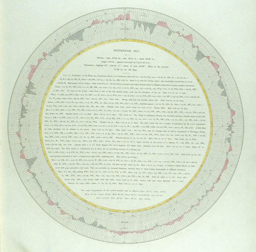
Illustrated plate from 'Barometrographia' by Luke Howard, image courtesy of libraries.ucsd.edu
Meteorology, out of the three topics, was probably the one I had encountered least often and knew least about. However, looking at the cartographical imagery superimposed with swirling, dramatic wind patterns, I realised how instantly familiar I was to the imagery of planetary weather. It is something we see everyday on the weather forecast and seeing demonstrations of climate activity from the 1800s it became clear to me how influential and effective illustrations such as Robert Fitzroy’s Weather Book are today. Many of the early meteorological observations pre-20th century were reliant on the information provided by explorers and mariners, and in the case of the ship The Rochester of the East India Trading Company, their logging of weather from 1709-12 were integral in understanding patterns of precipitation and wind. What makes the tables of data more exciting however, are the intricate illustrations of animals and ships that embellish the graphical information. Similarly, Luke Howard’s Barometrographia of 1847 shows lines of longitudinal and latitudinal points surrounded with the measure of air pressure as it’s tondo frame, acting both as a visual stimulus and providing supportive information.

'On the Mode of Commmunication of Cholera' by John Snow, image courtesy of WordPress
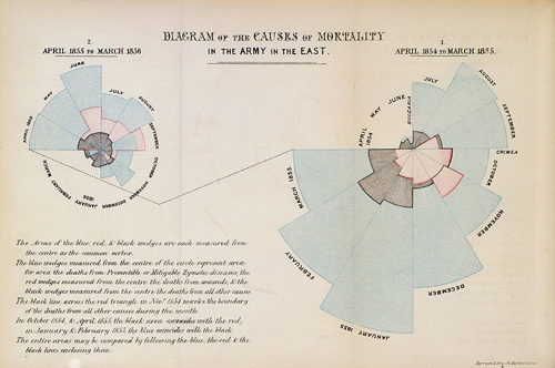
At the heart of global concern is the science of epidemics, and the utilisation of graphs and diagrams are no less integral to understanding health issues, as the exhibition continues to demonstrate. Behind the glass displayed Florence Nightingale’s influential Rose Diagram, representing in a concise, circular fashion the causes of death during the Crimean War. I was surprised to learn that as well as being one of the most important figures in British healthcare, Nightingale was also a celebrated and enthusiastic statistician.
Another exhibit which caught my eye was On the Mode of Communication of Cholera, 1845, a map which marked the places where the disease was reported in Soho. Here, the concentration around Broad Street helped health authorities to identify the exact pipe which the water-borne disease stemmed from.
As well as fascinating examples such as these, the exhibition also offers an interactive map, where the visitor can ‘play god’ for a few minutes, controlling a hypothetical epidemic configuring its contagiousness, source of origin and season of spread, watching the disease disperse across the globe in mesmerising red and orange trails.

'Rose Diagram' by Florence Nightingale, image courtesy of understandinguncertainty.org
Before going to this exhibition I knew Darwin’s work in the field of biological diversity and his Tree of Life was a landmark and treasure of British history, but it was only seeing it in the context of these other works that I understood its true beauty. The diagram of the trunk and branches of the animal kingdom not only create a digestible arrangement of the vastness of nature’s variety, but the symbolism of the tree also gives the diagram a sense of vitality and life. I was intrigued to learn that the tree was not exclusive in this respect, as Georg August Goldfuss’ 1817 System of Animals represented the animal world in the shape of an egg, another life-giving symbol. Two centuries before, Robert Fudd’s Great Chain of Being interpreted nature’s diversity through concentric levels of god, man, animals and minerals, overseen by Sophia, the goddess of wisdom. Today scientists employ the practical yet visually intricate methods of fractal geometry to depict the ever expanding scope of our understanding of the natural world, and interactive screens in the exhibition allow visitors to explore just how deep our knowledge is becoming through graceful animations of spiralling shapes.

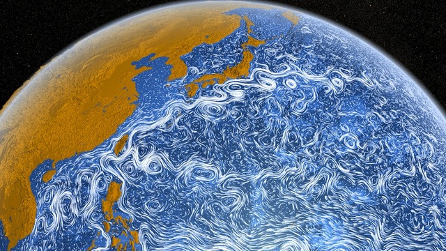
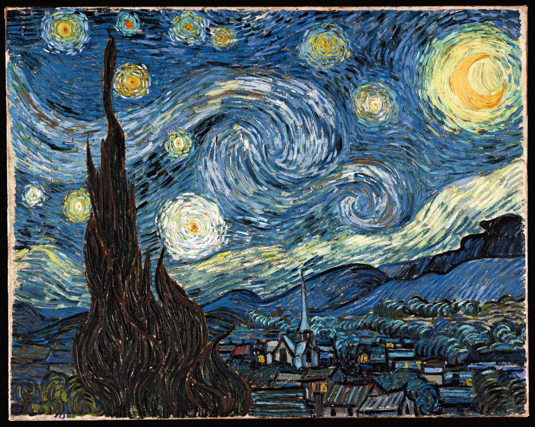
It did not surprise me what a large role imagery has played in the discipline of scientific learning but I must admit I was taken aback by the variety of different modes of representation which scientists used and still use. NASA’s video of the Perpetual Ocean, depicting the currents of the world’s water were animated in such a hypnotic, undulating manner that it began to resemble the romantic swirls of Van Gogh’s Starry Night.
The whole exhibition was a wonderful, visual and intellectual surprise. If you have spare time before May, head down and have a look – not only is it short and sweet, it’s also free!

Still from 'Perpetual Ocean' (2013), image courtesy of NASA

'Starry Night' by Vincent Van Gogh, image courtesy of Wikimedia Commons
